Project Details

Overview
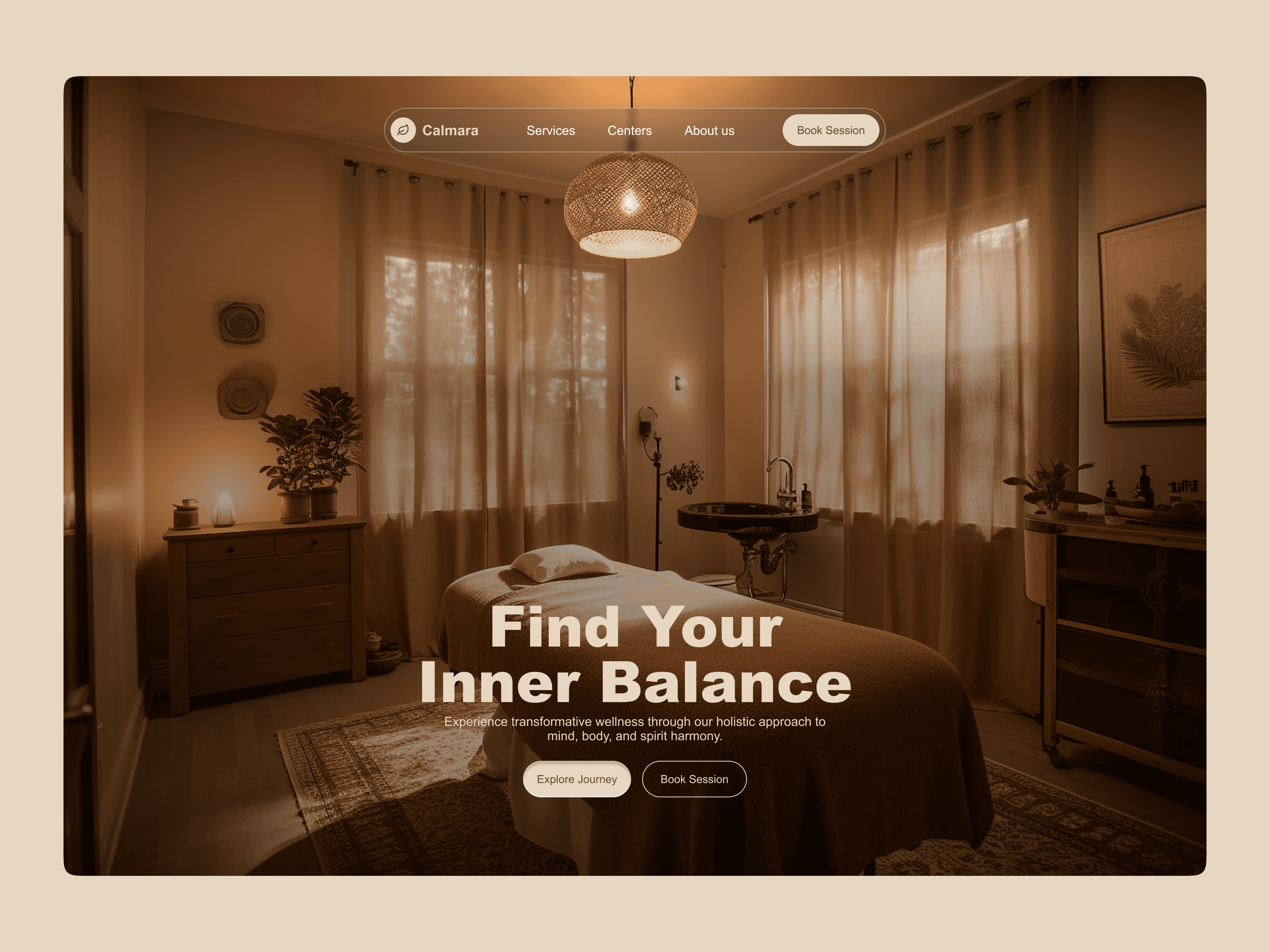
Thrive Wellness is the mental health app I wish I had at 20.
Most wellness apps are beautifully designed and completely alienating. They're built for someone who's already okay. The language is clean, the prompts are structured, and if you're overwhelmed or from a background where "therapy" carries weight, you feel it immediately. The app wasn't made for you.
I built Thrive to answer one question: what does a wellness app feel like when it's designed around emotional safety first?
The Problem
Wellness apps have a language problem, and it starts at the very first screen.
Calm opens with:
"Calm your mind. Change your life."
The word change is doing quiet damage. It assumes you arrive broken. And before you've tapped anything, the app has already set a bar for you to clear.
Headspace gets closer:
"Anxious days happen. Headspace helps."
That first sentence is genuinely warm — it sees you. Then the very next line:
"Feel less anxious with just two weeks of Headspace."
A timeline. For anxiety. The copy that just said "I see you" immediately hands you a countdown.
Both apps do the same thing in different ways. They centre the product the moment they sense they have your attention. The user is seen briefly, then redirected.
I wanted to design a content system where that redirect never happens. Where the app stays with you. That became the entire brief for Thrive's voice.

My Process
Content design isn't just writing. It's a series of decisions about what to say, where to say it, in what order, and in whose voice. Here's how I worked through each of those decisions on Thrive.
01 — Content Audit
Competitive analysis of Calm and Headspace
Before writing a single word for Thrive, I audited how existing wellness apps used language. I wasn't looking at features; I was looking at the emotional contract their copy made with users. I catalogued patterns across onboarding, empty states, error messages, and core UI labels.
What I was tracking:
Word choices that carried clinical or productivity baggage
Moments where the copy centred the brand over the user
Tone consistency — did the voice hold across the full journey or drop off after onboarding?
This audit gave me a clear picture of what Thrive needed to sound like — and more importantly, what it could never sound like.
02 — Affinity Mapping
Clustering research themes into content insights
I synthesised findings from secondary research on wellness app drop-off and mapped them into clusters.
Three themes emerged:
Judgment — users felt watched, measured, or evaluated.
Pressure — streaks, goals, and timelines created anxiety instead of relief.
Distance — clinical language made the app feel like a service, not a companion
These three clusters became the content pillars Thrive was designed to dismantle. Every subsequent decision ran through them: does this create judgment, pressure, or distance? If yes, rewrite.
03 — Card Sorting
Organising content around how users think, not how apps are built
I used card sorting to figure out how to structure Thrive's content architecture — what users expect to find where, and what language they'd naturally use to describe each feature.
The key insight: users didn't think in app categories like "mood tracking" or "wellness logging." They thought in feelings and moments — "when I'm having a bad day" or "when I want to remember something good."
That reframe shaped the IA directly. The Gratitude Loop moved to the primary entry point, not because it was the most feature-rich, but because it matched the most common emotional entry state.
04 — User Flow & Content Mapping
Mapping copy across every screen and state
I mapped content across the full user journey, not just the happy path, but all 12 user states, including empty states, error recovery, and low-mood check-ins.
05 — Tone & Voice Lexicon
Building the system that keeps the Encouraging Friend consistent
Once the Encouraging Friend persona was defined, I built a Tone & Voice Lexicon to keep the voice consistent across every surface. It wasn't just a list of dos and don'ts — it was a decision-making tool.
Research & Discovery
Finding 1 — Therapy-coded language creates walls. Words like session, practice, and achieve signal effort required before any value is felt. → Check-ins in Thrive are never tasks. They're moments.
Finding 2 — Streaks punish the people who need the app most. Miss a day when you're struggling — and the app tells you you've failed. → I replaced streaks with the Mood Forest. Missing a day doesn't kill the forest. It just means no new tree today.
Voice: The Encouraging Friend
Not a coach because coaches set targets. Not a therapist, therapists analyse. A friend. The kind who holds you without trying to fix you.
Three voice principles I used:
Stay with the user, not the product: every line faces outward
Name the feeling before offering anything: earn the right to guide
Hold the warmth across every state: the friend doesn't disappear when things go wrong
Collaboration
Solo project — but not designed in a vacuum. I shared drafts with other designers for honest feedback, which shaped a lot of the microcopy. Turns out "Chief" in the error message is either immediately charming or immediately jarring, depending on who you ask. Good thing I found that out early.
I built the Tone & Voice Lexicon to stay consistent across all states. It answered one question at every decision point: would the Encouraging Friend actually say this?
If this were a real product with a real team, the lexicon would be the first thing I'd hand to a new designer or PM. Content systems only work when everyone's pulling in the same direction.

Reflections
Thrive is the mental health app I wish I had at 20. Growing up, wellness spaces didn't feel made for people like me. Nobody was talking to the version of me that was overwhelmed and didn't have the vocabulary to name it yet. This project wasn't just a UX problem. It was a feeling I remembered.
What I'd do differently: Write for the hardest moments first. The Encouraging Friend needs to show up hardest when someone is really struggling, not just when they're getting started.
What this taught me: Most UX writing puts clarity first. This project taught me that for emotionally vulnerable users, feeling heard comes before being understood.